MoonCha was born from my love of traditional Chinese ink-wash painting — an art form that, akin to tea, carries centuries of quiet mastery behind every brushstroke and every cup.
I keep noticing the same divide: tea brands were either bright, modern, and playful, or deeply traditional but distant and dry. Very few honored tea’s long history while still feeling alive in the present.
I wanted Mooncha to be both.
It blends the elegance and depth of tea’s heritage with the energy, curiosity, and visual language of today. Each flavor, illustration, and package is designed to feel like a small moment of discovery — where ancient ritual meets contemporary culture.
MoonCha isn’t about choosing between past and future. It’s about letting them steep together.
MoonCha was born from my love of traditional Chinese ink-wash painting & tea.
Mooncha was made to address the market gap of dry teas that cater towards younger, more experiencial based consumers.
By combining the visual style and culture of ready-to-drink teas, such as boba, with a traditional chinese inkwash flare, Mooncha strikes an unique balance.
MoonCha isn’t about choosing between past and future. It’s about letting them steep together.


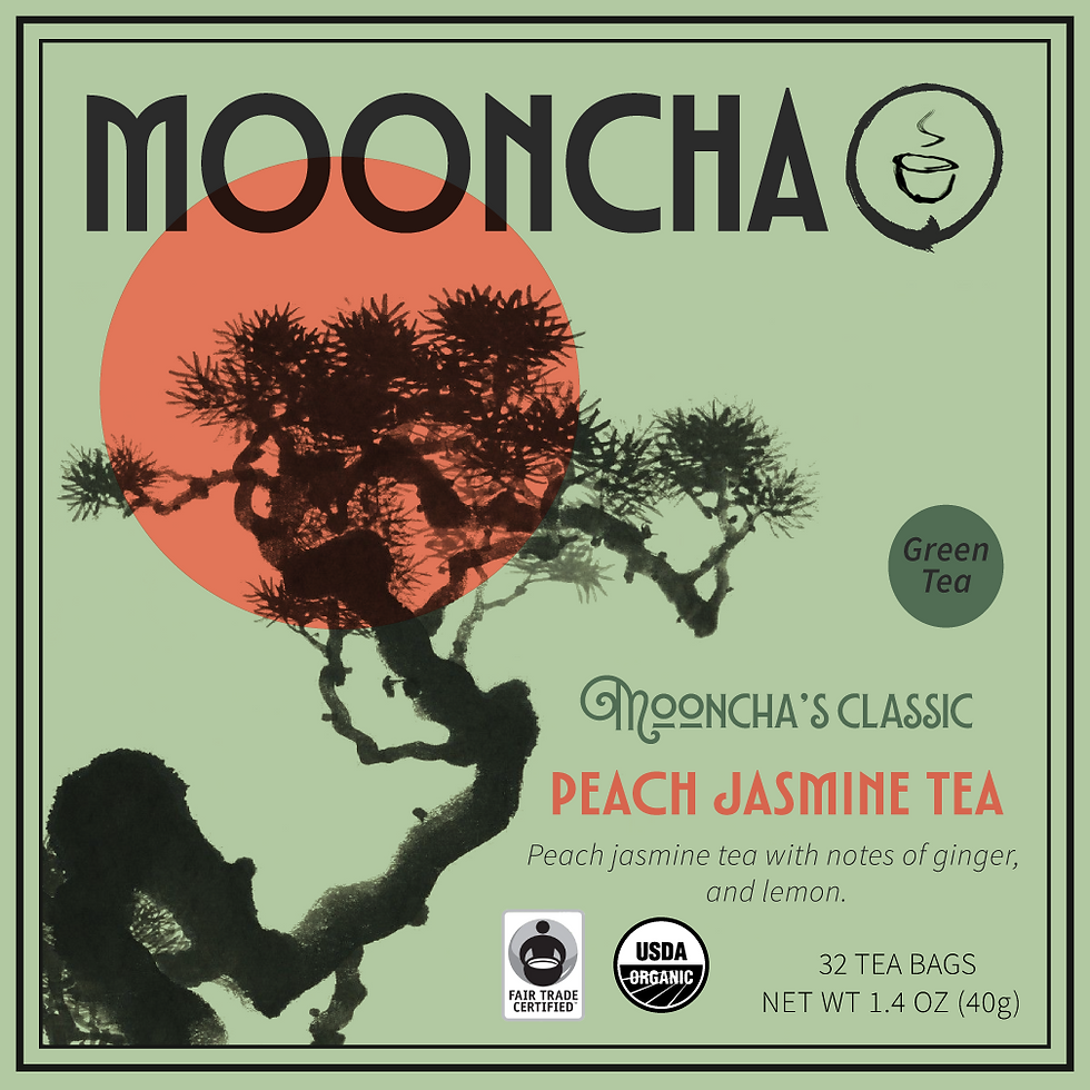
Typesfaces TT Modernoir and Lubaline were selected for the header and subheader to establish bold, readable typography while referencing a playful Art Nouveau influence.
Each flavor uses a mix of lower-saturation tones and high-saturation accents to create visual contrast while balancing a calming and energetic feel.


MoonCha seeks to meld the playfulness of new-wave tea culture with traditional dry tea packaging, creating a product that feels just as fun and refreshing as a weekly tea run.

#506D51
#D8654E
#B2C9A2
#F2CA67
#EB8750
#FAEC9C
#8879BC
#6861C9
#C2B4D3
process
inspirations


-
enso circles 円相; "circular form"
-
the art of Ike no Taiga (Japan, 1723-1776)
-
the art of Qi Baishi (China, 1864-1957)
-
art deco & art noveau posters of the 1880s-1920s
-
Stüler-Walde, Marie (1868 - 1904)

First icon concept: the chinese character (茶), or cha, inside a circle to represent the moon.
Final icon: Uses an Enso circle to represent the moon with an inkwash inspired tea cup illustration.
Early logo play - experimenting with enso circles as the "moon" element, inkwash style tea cup.
See early color experimentation below.


early package designs


final primary packaging designs
Designed to create a color block on the shelf, these three unique flavor designs are differentiable but undeniably the same brand.